Megan Sigler
Unedited VSH Photos


The goal of the visual scavenger hunt was to compose a gallery of images that reflect the elements and principles of art. I used my iPhone 11 to complete this assignment, which has a 12-megapixel camera. While taking my photos, I often looked to highlight on more than one element of art to compose an overall high-quality composition. However, I found some elements to be difficult to find, especially the primary and secondary colors. Overall, I think that I was successful in this assignment. My main takeaway has to be the new understanding of the elements of art and how they build an image. In the future I will be sure to consider each element when taking photos.
I usually tend to use Instagram to share my photos because it is easily accessible, and I know that all of my close friends will see them. I also like that there is a feedback system of likes, comments, shares, etc. that I can monitor. However, I am very exited to have a new platform to share my images on... my new website!
Edited VSH Photos


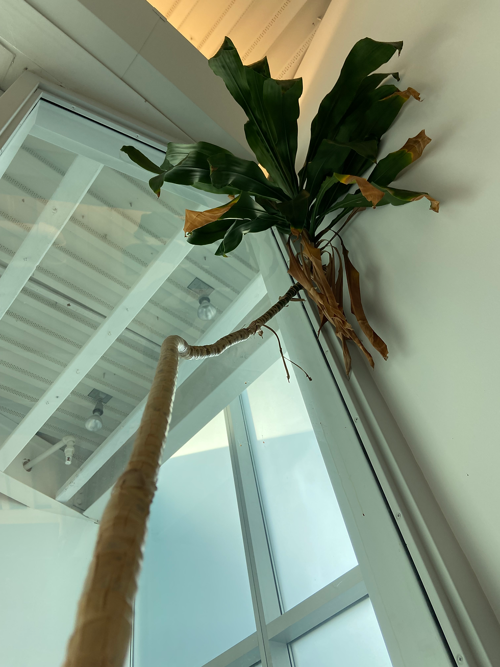
I used Adobe Photoshop to edit this image. The first thing that I did was flip the image 180 degrees horizontally. I did this because people tend to read photos from left to right. In my original photo, the focal point (the statue figure) is seen first, and then the eyes are led off the photo with the lines that the plant forms. On the other hand, in the second image, the lines of the plant lead the viewer's eyes back into the photo and to the focal point. Another change that I made was an addition of coloring and sharpness to the statue figure. I used the masking tool and the raw filter settings in photoshop to complete this. In the first image, the figure looks very unsaturated and unfit for the picture. In the second photo, the saturation and sharpness of the figure makes it a clear focal point. Additionally, it brings out the colors of the window in the background.


I also edited this photo in Adobe Photoshop. I made two big changes to this photo, which were the coloring/exposure and the crop/angle. I used the raw filter settings to alter the exposure. The first image looked slightly yellow, so I added blue tints and increased the exposure. Then, I used the guided crop tool to make the lines of the machines straight. Instead of appearing angled from the top, the image now appears to be faced perfectly straight on.


Typology Grid

For my typology assignment, I created a collection of images of shoes. I chose shoes because they typically have a comparable size and shape, which makes them consistent. When choosing which shoes to take photos of, I tried to choose similar styles and unique yet balanced colors. I chose similar sneaker brands, such as Nike, Converse, and Vans. They were fairly easy to photograph with a white backdrop and overhead lighting. After taking images of each pair of shoes, I used Adobe Photoshop to color correct and sharpen the photos. Other than these simple corrections, few photoshop tools were necessary.
Vector Logo Research

For my Vector Logo project, I will be designing a logo for a fictional company called Hometown Cafe. The products this company sells includes coffee, tea and baked goods. The values and descriptions of Hometown Cafe and its products are healthy, relaxing, loyal, and local. I will try to incorporate these values and descriptions within the logo that I design.
One of the first steps of creating a logo is to do a competitor analysis. I completed my analysis by collecting the logos of many various cafes. I organized them into categories using Adobe Illustrator. I try to sort the images by complexity and shape. The logos on the left are the simplest designs and they get more complicated towards the right. I also put the circular designs together in the top right corner.
While sorting the logos, I noticed that there is a wide variety of successful cafe logos. However, I also noticed some similarities. For example, the most popular colors are green and orange. The majority of logos also contain either "coffee" or "cafe." Additionally, a few of the logos shared the inclusion of a coffee cup within their design. I will take these similarities and differences into account when creating my own logo.
Vector Logo Sketches
For me, the most difficult part of this assignment was getting started. At first, I struggled to come up with ideas because I wanted every single sketch to meet my artistic standards. However, after rereading the instructions of the assignment, I remembered that it is okay for some sketches to be worse than others, because the point of the assignment was just to come up with simple ideas. After this realization, the assignment became much easier, and my ideas came much quicker.
One concept stood out to me the most from the articles that I read, which was that symbols are not essential for a successful logo. This concept changed my perspective by directing me to pay more attention to the font as well. Although I still included a symbol in the majority of my logo sketches, I realized that the symbol wasn't necessarily the most important part of the design.
I think that out of all of my sketches, number four and number seven are my favorites. Number four is very simple, and I think that it is a design that I could possibly build off of or keep simplistic. Number seven includes a symbol and words. I liked the layout of this design. I would like to look at the good qualities of each sketch and include them in my final logo.

The feedback that I received from my classmates was very helpful. One thing that we talked about was the shape of the coffee mug in my sketch. We agreed that it should have a slightly taller build. Additionally, we discussed what style of font I should use. My classmates suggested that I use a light, almost handwritten style of font to portray my company's values.
Vector Logo
I believe that my logo communicates a clear idea because the components are very straightforward. Based on the coffee cup alone, most people can most likely make a clear assumption about the type of products available from my company. I chose to incorporate a light, warm, brown color within my design because it portrays my company's values. It creates an earthy, cozy, and welcoming appeal that will draw customers in. For my font, I chose a decorative style that creates a personable feel, while still matching the brand of my company. It has some formality to it while maintaining a fun and approachable feel. I believe that this also portrays my company well by highlighting on the important values of community and loyalty.
Vector Tagline
Vector Product Template

I used a product template to display various versions of my vector logo design. Since I am marketing a cafe, I was sure to use a template with cafe products. I chose to use various versions of my logo because I do not think my original design would look the best on all products. For example, I don't think a coffee mug logo would look its best on a to go coffee cup. I think that all forms of my logo portray the values of my company in which I was attempting to achieve, as they are all very similar to one another.
Sound Artists
In class, we were given a small collection of videos of sound artists with the opportunity to write about our favorite one. Out of all of the artists' works, my favorite was Janet Cardiff's "Forty Part Motet." This work, which was described as a virtual choir, was far from anything I've ever seen in the past. My favorite part about this work specifically is when listeners can hear the choir during their break from singing. This break, as described by the video, adds to the work by making it more personable to the listeners. Overall, I am excited to learn more about sound artists, such as Janet Cardiff, because it is a field of art that I have never explored before.
Remix Manifesto
Watching "RiP: A Remix Manifesto" in class was truly an eye opener to the legal issues associated with sound art. Girl Talk is an artist who uses sampling methods to create new music. Since Girl Talk is so successful, it may be shocking for some to learn that the music they create is actually completely illegal. Because of copyright laws, the sampling of modern music is not legal. While I understand why it is important to have copyright laws, I do not agree with the extent as to which the laws apply. Girl Talk's music is often incomparable to the original song, so I don't think that copyright laws should apply in this scenario.
Experimental Soundscape Draft
This project is the first time I have ever worked with Audacity or any audio editing software. I tried a few different routes of completing the project, but this has been my most successful attempt so far. I found it easier to complete the video mash-up draft first and then align the audio with the public domain videos I could find. This is just a draft of my audio and I plan on making more changes in the near future. I hope to add more background noises to fill in the transitions between sounds and create a more cohesive piece. I also still need to finish the end of the audio so that it reaches the full three-minute requirement.
Experimental Soundscape
As stated above, this project was my first time ever working with audio software. I used Audacity and public domain audios to create my soundscape. I am very happy with how the final project turned out, given I was very new to this time of work. The most difficult part of the project was finding public domain audios when you have something specific in mind that you wanted to find. I enjoyed this project because it pushed me to try something I have never done before and probably would not have done without taking this course. Check out my final experimental soundscape and video mash-up below to see this audio be paired with a video.
Video Mash-Up Draft
This is the first time I have ever worked with videos, so it has been a great learning experience. I tried to incorporate videos with similar themes to tie everything in together, but it can be difficult to find exactly what you're looking for when only using public domain content.
Next, I want to change the video so that some images overlap each other to create a new effect. I also want to add/change filters throughout the video to affect the overall mood.
I have not yet added an audio to the video, but I am excited to work with Audacity to complete this last step. I am planning on incorporating many sounds of nature including wind, rain, birds chirping, etc.
Video Mash-Up & Experimental Soundscape
I used a slightly different route than my classmates when creating my video mashup. By this I mean that I created my video first, and then created a sound that matched it. I think that I was successful in this, but I also understand how I may have been more creative in my video if I would've created the sound first. This was my first time working with video and audio software, so I surprised myself with how the final mash-up turned out. The project was frustrating at times, and I think I have the audio memorized from how many times I had to relisten and rewatch to make sure everything lined up, but overall, I did enjoy this project. Being much different from anything I had done from the past, it took a lot of creative thinking, which I enjoyed. In my project, I tried to use repeating themes, such as water, flowers, and dance. I spread these themes throughout the video to create a repetitive effect. I also used audios that matched with these themes, such as rainfall and music box sounds. I learned a lot throughout this project, but two main things stuck with me. The first thing is that patience can bring your project to the next level. If I wouldn't have taken the time to line up the sound and video, it probably would not have been a successful project. The next thing that I learned is that I am capable of more than I originally thought. I think that this is a common theme in the class throughout the whole semester. I originally thought I was not capable of creating a website either, but here I am tying this explanation out on my own website. I did not think that I would successfully be able to put together a mash up video, but I am glad to see that I was successful.
Mash-Up Credits:
Sound Credits:
Wind Sounds | Effects | Sound Bites | Sound Clips from SoundBible.com
Walking On Gravel Sounds | Effects | Sound Bites | Sound Clips from SoundBible.com
Rain Background Sounds | Effects | Sound Bites | Sound Clips from SoundBible.com
Temple Bell Sounds | Effects | Sound Bites | Sound Clips from SoundBible.com
Baby Music Box Sounds | Effects | Sound Bites | Sound Clips from SoundBible.com
Freesound - "Symphony Sounds" by Lemoncreme
Freesound - "33 music boxes" by klankbeeld
Freesound - "Birds with reduced background noise1.wav" by Audeption
Freesound - "Heartbeat" by TobiasLudwig
Video Credits:
Pixabay - Graveyard Tombstone Grave - Free video on Pixabay
Luiz Jorge de Miranda Neto
Pixabay - Music Box Cashier Ballet - Free video on Pixabay
Pixabay - Poppy Field Red - Free video on Pixabay
Pixabay - Ballerina Dancer Abstract - Free video on Pixabay
Engin Akyurt
Pixabay - Woman Model Face - Free video on Pixabay
Engin Akyurt
Pixabay - Portrait Woman Wind - Free video on Pixabay
Engin Akyurt
Pixabay - Woman Model Face - Free video on Pixabay
Coverr-Free-Footage
Pixabay - Walking Sneakers Nike - Free video on Pixabay
u_rjjehevu
Pixabay - Flower Sunset Watering - Free video on Pixabay
Elen Lackner
Pixabay - Red Flowers Rain Drops - Free video on Pixabay
Jean van der Meulen
Pixabay - Rain Water Wet - Free video on Pixabay
InspiredImages
Pixabay - Grass Wind Breeze - Free video on Pixabay
Supra Naut
Pixabay - Fog Dewdrop Haze - Free video on Pixabay
Stefania Buzatu
Pixabay - Abstract Kaleidoscope Ballet - Free video on Pixabay